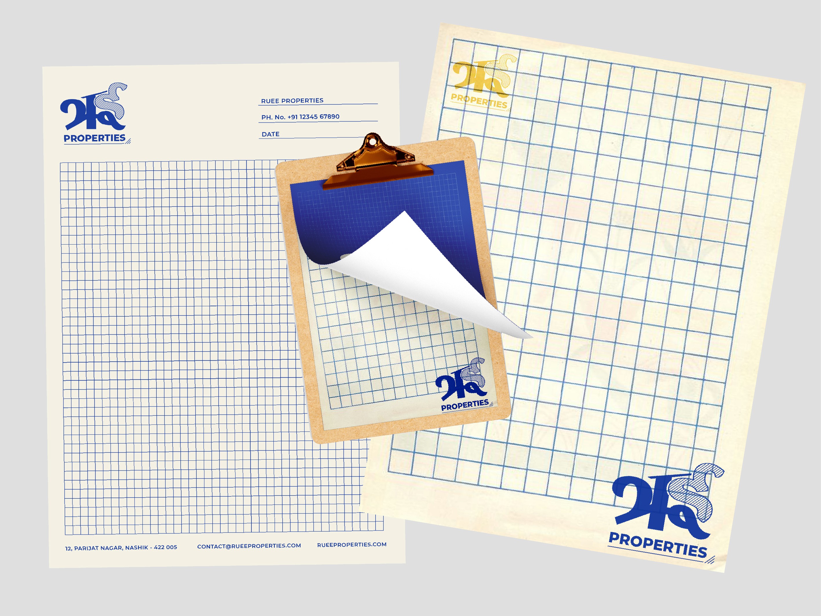
Ruee Properties
Rui Properties was an emerging real estate developer operating across Maharashtra. Sarbat’s brand design positions Rui as a trustworthy, culturally-rooted, and hands-on developer from day one. Inspired by 'paatya', the hand-painted nameplates of Marathi theatre, the Devanagari logotype of Rui establishes a bold visual connection to its cultural and regional roots.

Details like the underline and the three slant lines, traditionally hand-drawn by artisans with instinct and flair, are reinterpreted as brand elements across key touchpoints, especially the stationery. They are paired with checkered layouts, warm beige undertones, and old-school ink blue to create a tactile, lived-in aesthetic. The outcome evokes the feel of an old, well-respected Marathi office, an intentional cue to build credibility, trust, and comfort, critical for a young brand in a high-trust category like real estate.